Lightning Design System
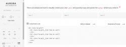
Lightning Design System is a new stylish CSS framework with an advanced grid system component (based on Flexbox, very customizable with ..
Download