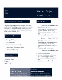
New Slick Resume Templates Pack
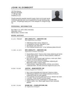
Once again, if you’re looking for a slick beautiful resume template for your job-hunt, you’ve come to the right place. This ..
Once again, if you’re looking for a slick beautiful resume template for your job-hunt, you’ve come to the right place. This ..
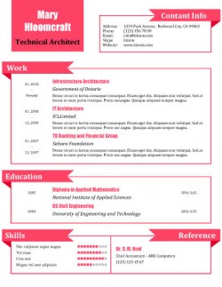
Finding a job is stressful enough, the last thing you need is trouble formatting your CV. We have prepared a list of free resume templates ..
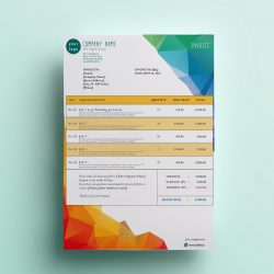
It’s almost a given nowadays: most small business owners and freelancers are great at what they do. But when it comes to taking care of their ..
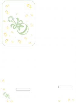
Baby showers are exciting celebrations for future parents, especially if the hosts are planning a surprise baby shower for the soon to be mom. ..
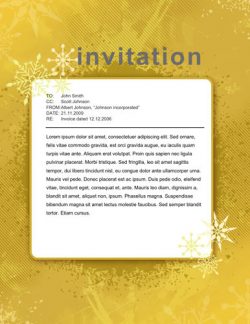
Crafting your party invitations are the first thing you need to do when you’re planning to throw a party. Your party invitations ..
Download
If you’re searching for decent free resume builder, this page should be of great help! Your resume is like a window to your skills ..
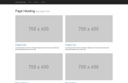
These are free grid-based bootstrap templates that are great for project showcasing / portfolio. Startbootstrap.com offers these ..
I’ve noticed that many people browsing TheGridSystem are searching for “newsletter templates”. These are also called email ..
Download

When it comes to surprising your loved ones , you might have a hard time choosing the right gift, especially if that person seems to have ..
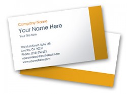
As an entrepreneur, your business card makes more of an impression than you think. Whether you have a small business, are a freelancer or the owner ..
Download